


 Exhibition: The Weatherspoon Art Museum
 Restaurant: The Coffee Break on Spring Garden
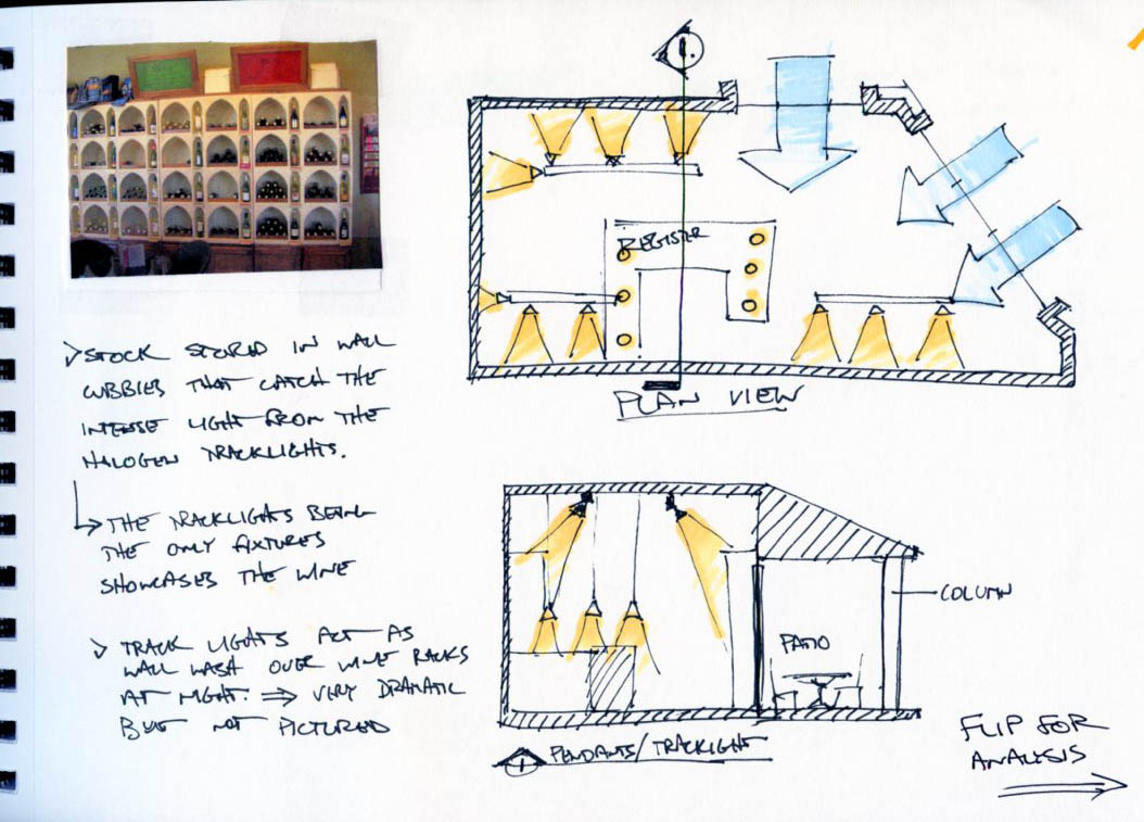 Retail: Winestyles
 The graphic on this one is pretty sketchy, it is much clearer when you are holding the paper in your hand. But the idea is a lighting solution for a strait or optimally, a curved hallway. It would be composed of lighting elements and slats to hide the luminaires. Light would be present, but the viewer would never see the fixtures due to the slats.
 This would be another circulations lighting solution. by creating baffles in the ceiling, with angled directional lights pointing in the direction of travel, the occupant's shadow would always be in front of them. This would be a neat effect almost like the light was pushing you from behind to move forward.
 while it is not a designed lighting example, this concept art shows great use of light to reinforce the perspective points of the drawing.
 "curtain lighting/fog"
 This floor lamp is so minimalistic, and yet so elegant. It personifies design in a very pure and un-diluted fashion without any distracting elements. This design conveys an approach, more than just it's design. A whole building could be designed from this lamp alone because of this fact.
  The lit cocktail tables in this club act as centers of attention, or gathering places. It is almost as if you "pull up a light fixture" as you would a chair. Very interesting.
 The connection between form/architecture and the lighting fixture here is particularly good. It is very understated and impressively simple but yet so strong. It is almost as if the ceiling light panels are funneling the light through the boxes like gutters to a downspout. Very interesting effect.
 I really enjoy this ceiling solution because the light fixtures create the ceiling plane. It recreates the ceiling we experience, and especially how we experience it. It is design like this that really grabs us and gives us that "wow" factor. This effect is exacerbated particularly through the use of the semi-reflective floor surface.
 This has got to be the coolest idea for a clock. The light panes act as the digits in the same way a small watch or clock radio would. The innovation here is simply the scale of application. Everyone expects the time of day to be presented in a particular scale, normally small. When this is blown way out of proportion and used to dominate a space, the result is a very intriguing design composition.
 I absolutely love Richard Meier's work, this gallery space in particular. The way the light casts on the slats of the ceiling looks incredible. Most art galleries are very boring and washed. This adds a little bit of understated flair to a normally bland environment.
 This picture makes me imagine if there were several panes of glass layered at a particular offset. Each having some sort of etching on it. If you light the panes from the sides, and conceal the edges of the glass, as well as the light source, what would remain to be visible is a 3D image that appears to float in space. I have seen this done with shop cash wraps and such. It could be interesting.


